Elements of graphic design
Graphic design is a visual language of principles and elements that come together to convey a message to the viewer. You can use digital art tools such as Clip Studio Paint to create your design work, but you also need a good understanding of graphic design principles.
In this article, learn about the foundations of design to learn how to arrange shapes, text, and other elements to convey your message best.
The elements of design
The fundamental elements of design are line, color, shape, texture, value, space, and form.

Line
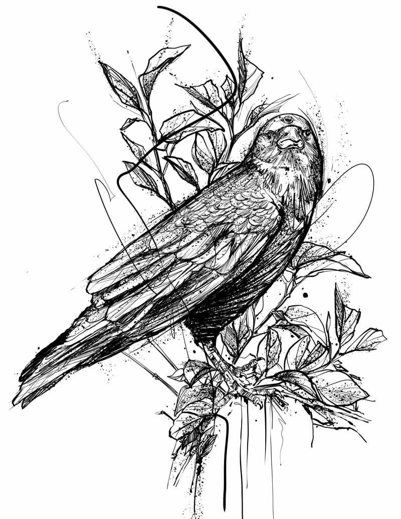
A line is an element that connects two points. Lines can be straight or curved and of any thickness, length, angle, or color. They are a flexible and simple element that can guide the eye in designs. Lines can also be implied.
In Clip Studio Paint, you can use vector layers or figure tools to draw clean lines with control points that you can edit later.
Color
Color has three aspects: Hue, Luminosity, and Saturation. Colors strongly affect the mood of an image, so it is useful to know color psychology and color theory for effective designs.
Tools such as the Intermediate Color palette and Gradient Maps can help you create harmonious color schemes.

Shape
A shape is a 2D area with a defined or implied edge that separates it from other elements. Shapes can be geometric or organic, composed of smooth or straight lines. A design with many curves gives a softer feel, while a design with many straight lines and corners gives a more rigid feel. You should also consider the negative shapes created between the shapes that you deliberately add.
In Clip Studio Paint, use figure tools to create geometric shapes with any number of sides.
Texture
Texture refers to the surface quality. Texture can be physical (tactile) or visual. For example, tactile texture can be the material of the paper a design is printed on. You can also visually express textures through the use of color and value.
Clip Studio Paint contains image materials that you can use to add texture to your design.
Value
Value refers to the lightness or darkness of an object. This can also relate to the hue of elements used in the image. A contrast in values creates a sharper separation between elements, while a smooth gradation of values creates a sense of continuity.
Value can also affect how close or far we perceive an object.
Space
The element of space includes both positive space, which means parts filled with an object, and negative space, which means the other unfilled areas and the background. In design, you can use negative space to draw attention to positive space.
Form
Form refers to a 3D object with volume. While this element primarily applies to physical designs and works of art, you should also know how to apply the principles for representing 3D forms on a 2D image. You can use shadows and highlights to suggest mass and physical volume. One example is embossing and shadows.
Principles of graphic design
Now that you know the basic elements that make up any design, let’s look at some principles for arranging them effectively. The seven major design principles are Emphasis, Balance, Contrast, Repetition, Proportion, Rhythm, and White Space.
Emphasis
A visual hierarchy of information is needed to highlight the most important parts. Before creating your design, think of the information that needs to be conveyed and the priority of each. You can use other design techniques, such as scale, contrast, and color to achieve the desired hierarchy. For example, if you were creating an advertisement for a toy featuring a popular character, making the character more prominent than the product name would better attract the attention of the target user. If you want the product name to be memorable, you might enlarge the product name instead.
Balance
Balance refers to how the design elements are arranged within the composition. You don’t want it to be weighted too heavily in one area. However, asymmetrical designs can still be pleasingly arranged, for example, by balancing one large element with several smaller elements on the opposite side. Symmetrical designs will always be balanced by nature, but can sometimes be too static or boring. Remember that balance does not only refer to the scale of elements, but also the color and texture.
Contrast
Contrast creates a distinction between different elements in the design and is another way of guiding the viewer’s eye to the most important parts. People are naturally drawn to areas with high contrast. For an appealing combination, make sure that the background is visually distinct from foreground elements while keeping an awareness of color theory.
Contrast is also important for readability and accessibility. For example, light-colored text on a white background may be difficult to read. Contrast for each element is essential to make the elements placed recognizable.

Repetition
Consistency in the colors and fonts used for related elements creates a sense of unity and stability. Repetition helps to simplify the design by creating a relationship between different elements. Across multiple design pieces such as a website, flyer, and business card, repetition also reinforces a brand identity.

Proportion
Proportion refers to the scale relationship between multiple elements. This concept is also related to emphasis and balance. You can improve the proportion by adjusting elements, such as making other elements smaller and the background margins smaller to make the things you want to stand out larger. When considering the proportions of your design, it can help to think of it in sections rather than each individual element or the page as a whole.
Rhythm
Rhythm is how you arrange the composition to lead the viewer’s eye. Effective rhythm or movement in a design piece will naturally lead the audience through the information without getting stuck on any one element. You can use other principles, such as emphasis, repetition, and proportion to guide the viewer.
White space in design
White space is any area in a design that does not contain any design elements. This is also called negative space.
White space is critical for organization in a design by separating elements from each other. If you squeeze too much together, no single element will stand out. Placing white space between elements makes them stand out and improves the design.
How to start applying design principles
Now that you know the elements and principles of graphic design, you can apply them to your projects. See this list of beginner graphic design projects with accompanying tutorials to get started and build your portfolio while learning the skills you’ll need.
Graphic designs are best created with digital drawing apps, so try out Clip Studio Paint free for up to six months while you learn the fundamentals.
What Artists Are Saying About Clip Studio
-
 Paco SordoIllustratorSpain
 - I use [Clip Studio Paint] every day
-

-
 Ricardo BessaIllustrator & Storyboard ArtistUK
 - The pencil tool in CSP is one of the best I've tried
-

-
 Bryan Sánchez M.Tattoo artistColombia
 - My… lines flow so naturally with Clip Studio Paint
-
-
 Ian JepsonIllustrator, DesignerSouth Africa
 - I've recommended [Clip Studio Paint] to every illustrator I know
-

CLIP STUDIO PAINT PRO
for character art, concept art, illustration
CLIP STUDIO PAINT EX
for comics, manga, webtoons & animations
PRO
EX
Single-page illustrations & comics
Multi-page comics/manga & illustrations
Up to 24 frames for gifs or short animations
Unlimited frames for professional animation
Natural, customizable pen and brush tools
Vector layers
More than 10,000 free downloadable brushes and materials
3D models and drawing figures
PSD compatibility
RGB and CMYK compatible
For macOS and Windows
-
Export and print multi-page files
-
Convert images and 3D models into lines and dot shading
Free technical support
Free web services & community
Clip Studio Ask / Assets / Tips / Share
Learn more about other genres!